
このブログでは、統計解析ソフトStataのプログラミングのTipsや便利コマンドを紹介しています.
Facebook groupでは、ちょっとした疑問や気づいたことなどを共有して貰うフォーラムになっています. ブログと合わせて個人の学習に役立てて貰えれば幸いです.
さて、今回はグラフ編集の裏技をご紹介します.
グラフ作成の際にも、本サイトを見ていただいている皆様であればDo fileを使ってコマンドを入力されている方が多いのだろうと推察しますが、コマンドで入力した内容がうまく反映されなかったりして、結局はエディタを使って手入力に頼ってしまう、何てことありますよね.
解析方法が少しだけ変わってやり直し、となったときにどんな手順でやったかを思い出すのに苦労したりして結構手間がかかってしまったりします.
そんな時、グラフエディタの録画機能を使ったちょっとしたテクニックを使うとグラフの編集をコマンドベースで行うことができます.
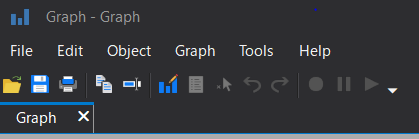
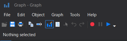
グラフ編集画面にすると、ツールバーが以下のように表示が変化します.この赤色のボタンが録画機能なのですが、それをうまくつかうとよいのです.
今回は、この機能を使ってどんなことができるのかを見ていきましょう.
1.グラフ編集を録画する
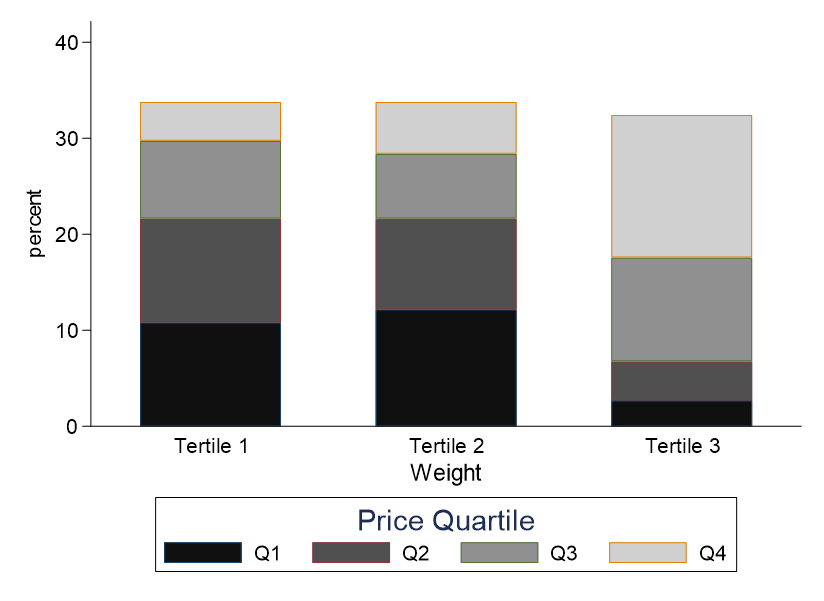
いつものように、autoのデータを使ってやってみます.
車体が重くなるほど値段が上がる、みたいな関係を示した棒グラフをつくってみます.
sysuse auto, clear
xtile pricecat=price, n(4)
xtile weightcat=weight, n(3)

label define price 1 "Q1" 2 "Q2" 3 "Q3" 4 "Q4"
label values pricecat price
label define weight 1 "Tertile 1" 2 "Tertile 2" 3 "Tertile 3"
label values weightcat weight
graph bar, over(pricecat) over(weightcat) ///
	asyvar stack b1title(Weight) legend(title(Price Quartile) row(1)) ///
	graphregion(color(white)) ylabel(,ang(0) nogrid)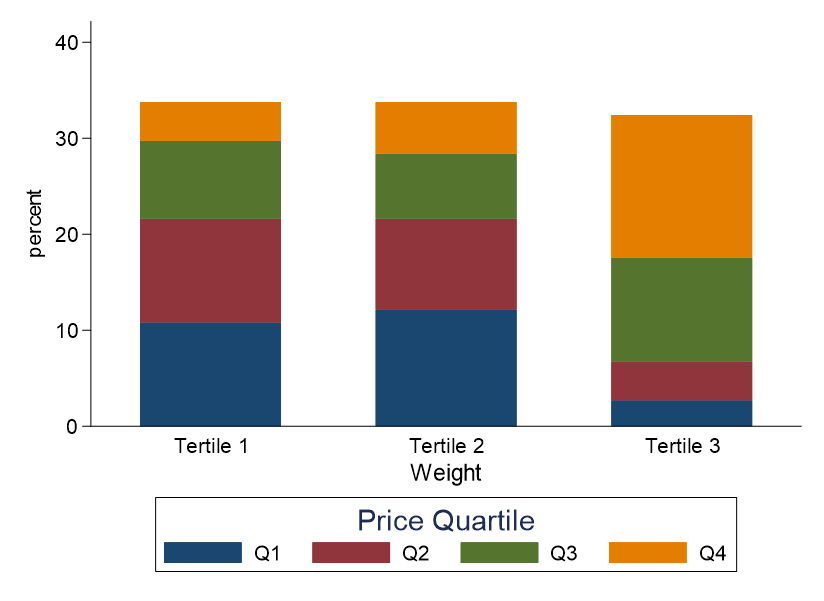
ここで、グラフエディタで敢えて編集してみましょう.
グラフの色味を変えるような編集を加えてみたいと思います.
グラフエディタから、グラフ中の一部の箇所、値段の四分位の最も高いところをGrayscaleの13番あたりにしてみます.
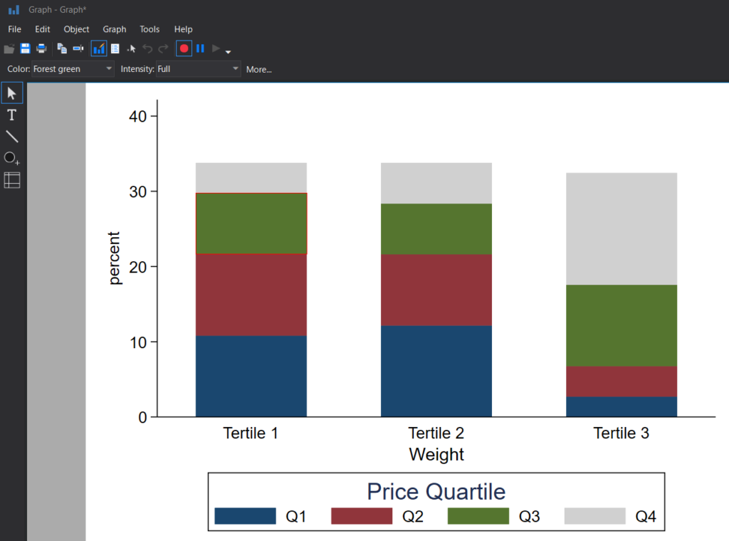
この一連の操作を録画しながら行います.録画が終わったらもう一度赤いアイコンを押してください.
すると、以下のような表示がでてきます.これをBrowseと選択してください.
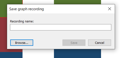
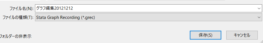
そしてフォルダを選択したら適当に名前を付けて保存しましょう.
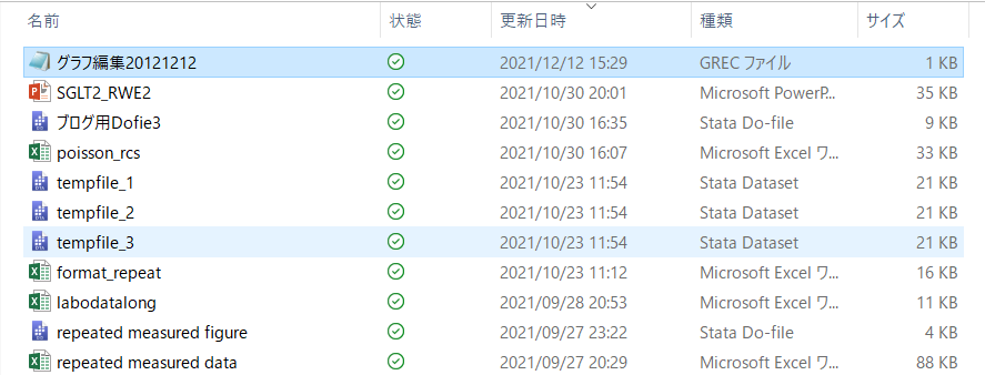
メモ帳か何かで開いてもらえれば中身を確認できます.
自分のはこんな風にでてきました.いろいろ紆余曲折しているのがわかるかと思います.
StataFileTM:00001:01100:GREC:                          :
00007:00007:00001:
*! classname: bargraph_g
*! family: bar
*! date: 12 Dec 2021
*! time: 15:29:06
*! graph_scheme: s2color
*! naturallywhite: 1
*! end

// File created by Graph Editor Recorder.
// Edit only if you know what you are doing.

.plotregion1.bars[4].style.editstyle shadestyle(color(gs16)) editcopy
.plotregion1.bars[4].style.editstyle linestyle(color(gs16)) editcopy
// bars[4] color

.plotregion1.bars[4].style.editstyle shadestyle(color(gs13)) editcopy
.plotregion1.bars[4].style.editstyle linestyle(color(gs13)) editcopy
// bars[4] color

.plotregion1.bars[4].style.editstyle linestyle(pattern(dot)) editcopy
// bars[4] pattern

.plotregion1.bars[4].style.editstyle linestyle(pattern(solid)) editcopy
// bars[4] pattern

// bars[4] pattern


// <end>
最初はGrayscaleの16番にしてしまったのですが、色が白に近すぎて変更しました.
ここに記載されたsyntaxでは当然ながらグラフのプログラムに直接組み込んでも、はたまた改行してそのまま走らせようとしても、一切動きません.
ほんの少しの小細工で済みます.gr_editというコマンドの後にここに書かれているような内容をつづければよいのです.ここで記載されている通りにではなく、”editcopy”というのは消す必要があるようです.
gr_edit plotregion1.bars[4].style.editstyle shadestyle(color(gs13))この部分を解読するに、「plot領域1番目の4つ目の要素のスタイルを変更→グラフの色をgs13に変更」
ということが書かれていそうです.
2.グラフ編集をコマンドで行ってみる
ということで出来上がったグラフの色味を変更してみます.手動でグレイスケールにしてみます.
1~4のすべての要素を、グレイの暗い色から明るい色でグラデーションをつくってみましょう.
gr_edit plotregion1.bars[4].style.editstyle shadestyle(color(gs13))
gr_edit plotregion1.bars[3].style.editstyle shadestyle(color(gs9))
gr_edit plotregion1.bars[2].style.editstyle shadestyle(color(gs5))
gr_edit plotregion1.bars[1].style.editstyle shadestyle(color(gs1))
これでは外枠が元のままですので、線も変更が必要そうです.
gr_edit plotregion1.bars[4].style.editstyle shadestyle(color(gs13))
gr_edit plotregion1.bars[3].style.editstyle shadestyle(color(gs9))
gr_edit plotregion1.bars[2].style.editstyle shadestyle(color(gs5))
gr_edit plotregion1.bars[1].style.editstyle shadestyle(color(gs1))
gr_edit plotregion1.bars[4].style.editstyle linestyle(color(gs13))
gr_edit plotregion1.bars[3].style.editstyle linestyle(color(gs9))
gr_edit plotregion1.bars[2].style.editstyle linestyle(color(gs5))
gr_edit plotregion1.bars[1].style.editstyle linestyle(color(gs1)) 
3.カラースキームを変更する
上記のように手動で実施する方法を知るのも大事ですが、便利なコマンドを知ることもよいでしょう.
モノクロにしたい場合には、s1monoを指定してからグラフを描きます.
set scheme s1mono
graph bar, over(pricecat) over(weightcat) ///
	asyvar stack b1title(Weight) legend(title(Price Quartile) row(1)) ///
	graphregion(color(white)) ylabel(,ang(0) nogrid)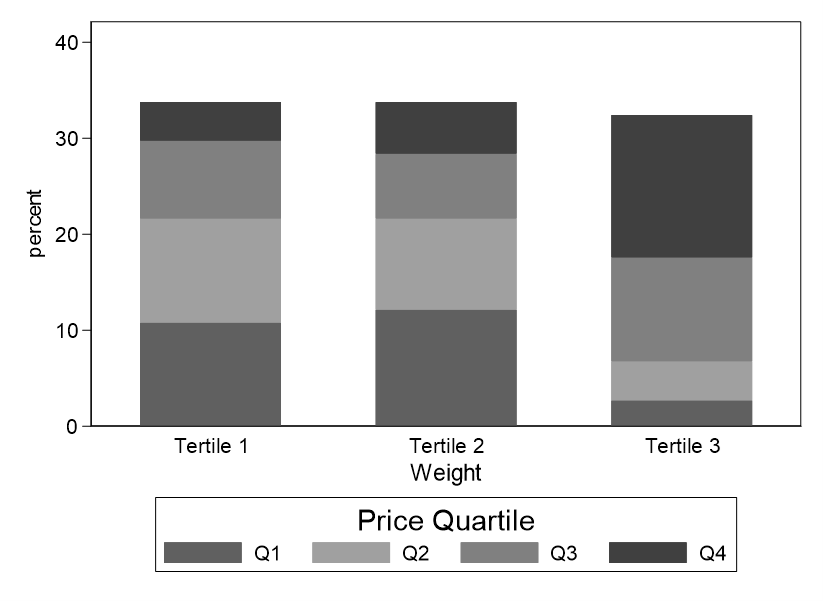
set scheme plotplain
graph bar, over(pricecat) over(weightcat) ///
	asyvar stack b1title(Weight) legend(title(Price Quartile) col(1)) ///
	graphregion(color(white)) ylabel(,ang(0) nogrid)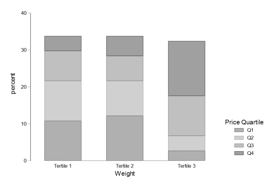
なかなか渋いですよね~.元に戻したいときは、set scheme s2color としてください.
こういう技を使えるのも大事です.
4.コマンド入力にこだわる
そうはいってもコマンド入力にはこだわりたい!という方もいらっしゃいます(漢!)
棒グラフの場合にはboxというオプションを使って一つずつ指定します.
graph bar, over(pricecat) over(weightcat) ///
	asyvar stack b1title(Weight) legend(title(Price Quartile) row(1)) ///
	graphregion(color(white)) ylabel(,ang(0) nogrid) ///
	box(1, lcolor(gs1) fcolor(gs1)) ///
	box(2, lcolor(gs5) fcolor(gs5)) ///
	box(3, lcolor(gs9) fcolor(gs9)) ///
	box(4, lcolor(gs13) fcolor(gs13))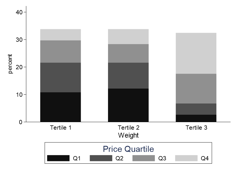
まとめ
ということで、グラフの編集に関する裏技をご紹介しました.
これは絶対に使えますよね!

コメント